Back in December, I randomly got the sudden urge to try graphic design.
After spending way too long scrolling through Pinterest on my dorm bed in Richmond Hall, I kept seeing these incredible posters and collages people had made, and I thought, you know what? I kind of want to try that. Even though I’m definitely the kind of person who spends way too much time making presentations look pretty instead of actually working on the information, I’d never really attempted this style of design before. It sounded fun.
Around that same time, I realized I hadn’t actually posted anything from my recent shows since Something Rotten! during my freshman year. I’d always liked documenting each production I’d been in, but I didn’t really want to make another post that was just a bunch of rehearsal and performance photos. If I was going to keep the tradition going, I wanted to make something different.
Ironically, the entire project started because of one photo. During my school’s dress rehearsal of our black box production of A Midsummer Night’s Dream in October, our incredibly talented photographer had taken this absolutely sick picture of my friend Mariyam, who played Demetrius, sitting with her head lowered in this dramatic pose. I loved the composition so much that I wanted to make it even cooler. One edited photo didn’t really feel like enough for an Instagram post, though, so I started gathering every production photo I even remotely liked, organized them into folders on my laptop, and got to work.
To make everything, I bounced between Canva, Photoshop (with plenty of help from my dad because Photoshop is impossible. Plus, graphic design is a huge part of his job and he went to graduate school for it, so I’ve always loved the advice when I’m doing art), and PowerPoint for one of the designs.
I wanted every graphic to have its own personality. The lovers became elegant and romantic. The mechanicals were funkier and more playful. The fairies leaned into something more whimsical. Instead of making every slide feel the same, I wanted each one to match the energy of the characters it focused on.
At first, everything went surprisingly smoothly. I was having a great time, and this was a fun activity to continue in my pastime, not frustrating at all.
…Then I started the solo character posters.
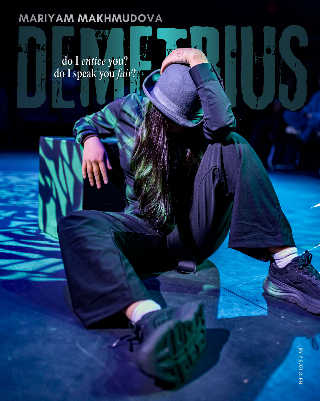
Demetrius had been the first one I made and looked pretty freakin’ awesome if I do say so myself, so naturally I assumed the rest would be pretty straightforward.
Oh, how I was wrong…
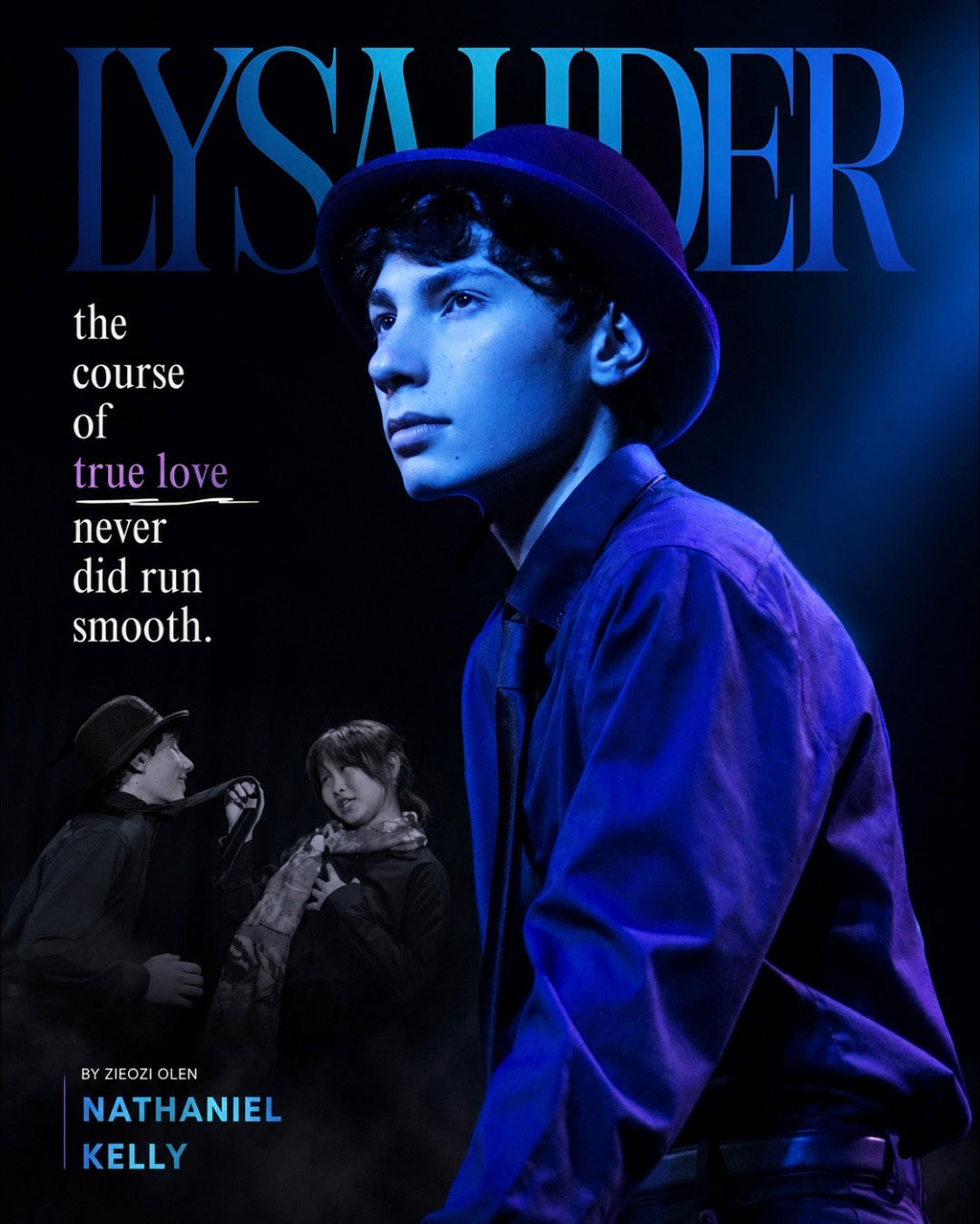 Lysander fought me the entire way because Nathaniel, the actor, unfortunately didn’t really have many photos taken of him that worked well on their own. Most either couldn’t be cropped cleanly or just didn’t fit the composition I wanted, so I had to get pretty creative. Thankfully, one of my teachers had taken an absolutely incredible picture of Lysander and Demetrius together, so I ended up using Photoshop to remove Demetrius from it and rebuild the image around Lysander instead.
I thought that was difficult.
Then came Hermia. I honestly don’t know why this design gave me so much trouble. Katy, who played Hermia, is one of my close friends, and I had the pleasure of playing her best friend on the stage. I actually thought I had already finished this design before I continued with Lysander. But there were so many photos of her that I wanted to include, and every time I thought I had something working, the colors felt wrong. Then the fonts looked wrong. Then the layout looked wrong. I’d fix one thing, and then something else bothered me, and between every design that followed it, I kept coming back to tweak something.
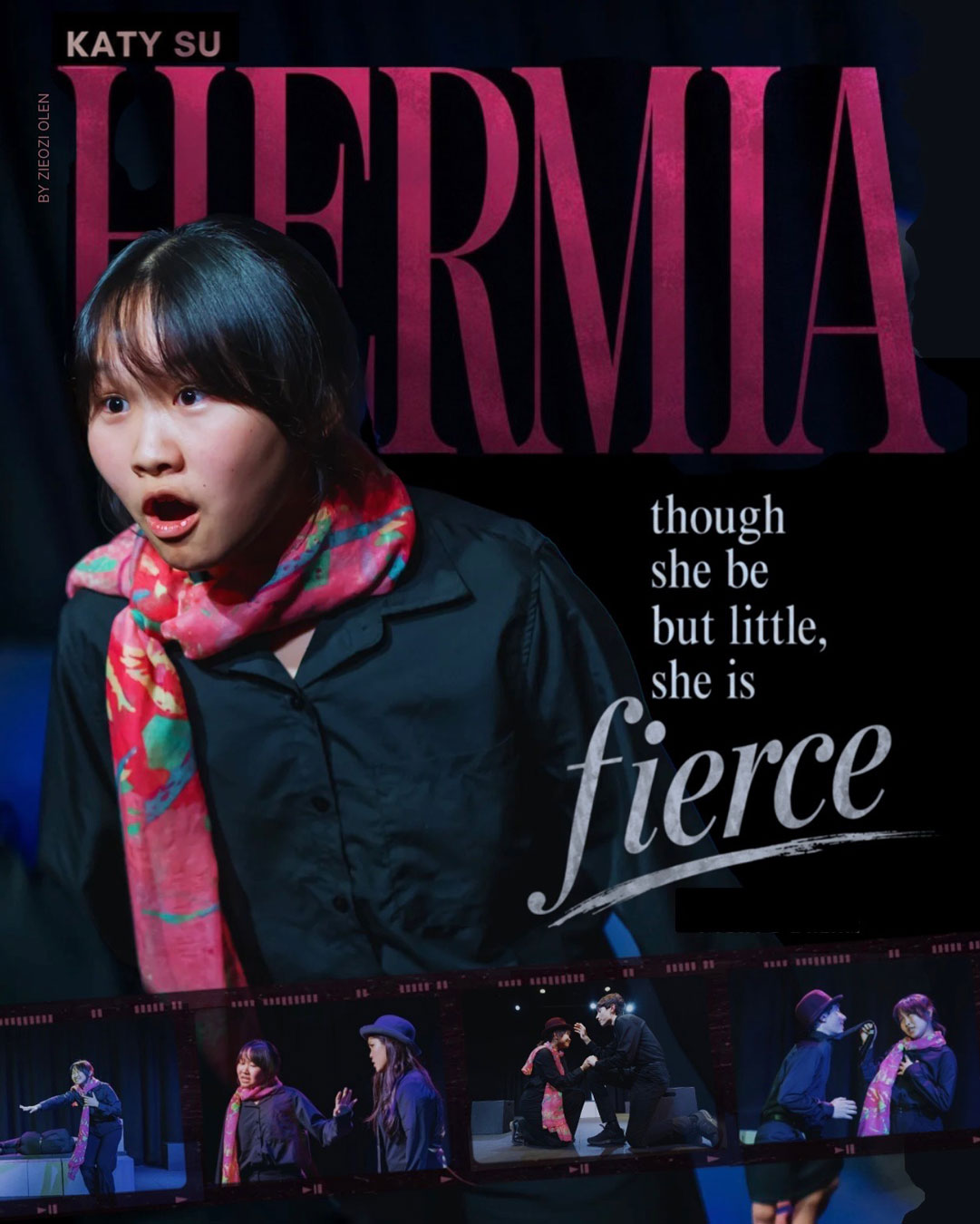 Looking back, Hermia is probably the reason this project stretched from winter all the way into summer. That, along with my odd underlying urge to include at least close to all of the photos I had chosen for this project.
Originally, I had expected to finish everything before our spring musical so I could immediately start designing graphics for that production too.
Clearly… that didn’t happen. As I’m writing this blog, I haven’t even started on The Burrow, because I am currently recovering from the effort required to making this haha.
With the amount of time everything was taking me, I already knew a solo Helena poster probably wasn’t happening (the way I was posed made it incredibly awkward to design around), I decided to use one full-stage photo I really loved of myself instead of cropping it. I had the random thought of transforming this into a Netflix page, and after way too much experimenting, I turned the image into a fake streaming service called “Neotheatre,” named after our theatre. The “Popular This Week” section became all of the productions I’d both been in and been present for before A Midsummer Night’s Dream, and, because I couldn’t resist the joke, I made Shakespeare the profile icon of the viewer.
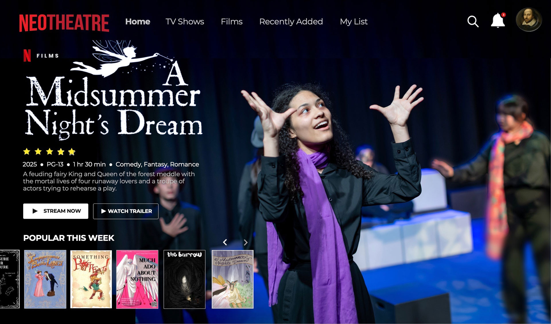
That design, and the fairy magic graphic that followed it, also meant more Photoshop adventures. I was kinda getting the hang of it! I am proud to say that I am a professional in removing the background of something (yes, I’m aware it takes the click of like two buttons, but still). I moved characters around to strengthen the composition, enlarged people who had originally been too far away, and had characters overlapping text to make each graphic more dynamic and interesting. Little details like that became some of my favorite parts of the entire project.
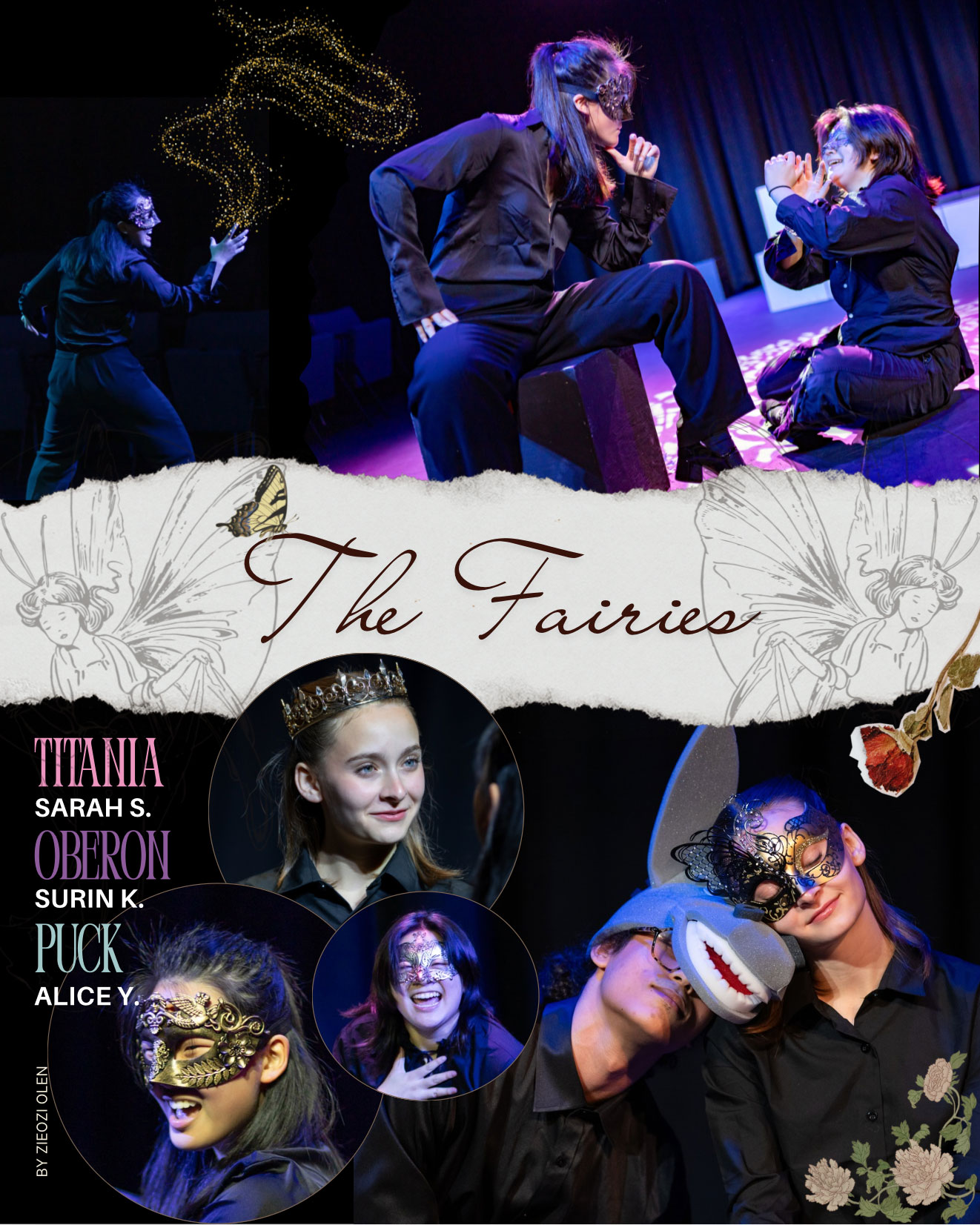
The fairies graphic ended up becoming my favorite apart from Demetrius’s. I think it captured exactly the whimsical atmosphere I had pictured in my head from the beginning. My favorite detail is probably the little bit of magic coming from Surin’s hand, who played Oberon. In our production, Oberon’s magic was represented simply with a rose, like in many traditional productions. I absolutely loved one of the photos of her that I wanted to use, but she wasn’t actually holding the rose in it. Ugh. So instead, I decided to represent the magic with a glowing sparkle effect coming from her hand. I honestly love how it turned out, and I’m especially grateful the background of the design is black because that sparkle is a Canva Pro element and there was absolutely no way I was paying for one graphic. (Pro tip: if you’re making something for Instagram, you can just screenshot the design. Instagram compresses the image quality so much anyway that you can barely tell the difference.)
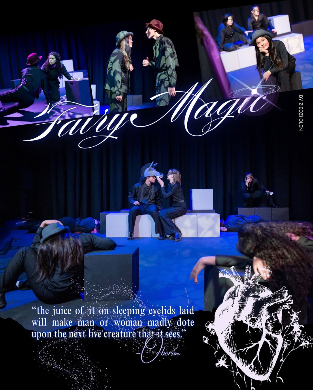 The fairy magic graphic had one of my favorite little hidden details, too. In the top strip, I very subtly implied that Lysander and Demetrius had fallen in love with each other after being enchanted, even though that definitely didn’t happen in our production. It was just a small nod to the National Theatre production I’d watched while preparing for auditions, where they leaned into that idea. I thought it was hilarious. It would’ve been awesome if our production went in that direction, too, but hey, at least I got to make it canon in my graphic.
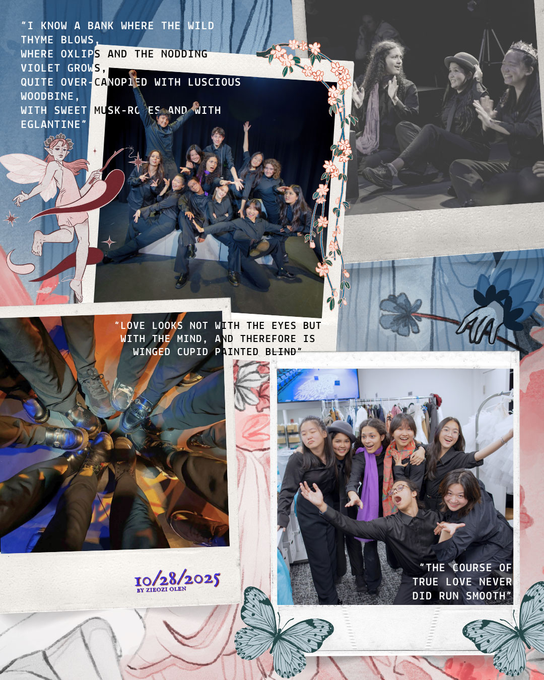
After that, I polished the fairy magic graphic and made one final collage centered around behind-the-scenes photos.
For my Something Rotten! post, I’d split everything into three separate Instagram posts because I genuinely didn’t know you could upload more than ten pictures. (Apparently desktop Instagram and mobile Instagram are different from each other regarding the limit on posts.) Part of the reason I liked making collages rather than just uploading the original image is because I enjoyed being able to fit dozens of memories into one design. I even used the show poster my friend Katy illustrated as the background for the behind-the-scenes graphic and placed layers of polaroids on top of it. One of my favorite little details is how the hand on her poster fits nicely between two of the photos.
 As I have already stated, I had originally wanted solo graphics for both my brother, who played Bottom, and me as Helena. Eventually, though, after months of focusing on these designs I had to admit that I was simply out of energy, and I needed to just let it go. Plus, the unedited photos were really good anyway, so I uploaded our portraits as they were instead.
Strangely enough, I’m kind of glad it took so long.
Over those months, my eye for design changed a lot. Going back through the earlier graphics, I found myself making little adjustments everywhere. Demetrius’s poster only needed a few value changes, but those darker tones made the entire piece feel dramatically different. Hermia, on the other hand, ended up looking almost nothing like the original version I’d made months earlier. And the group lovers design ended up with their images overlapped when they originally weren’t.
Looking back now, my favorite graphics are still Demetrius’s poster and the fairy collage. I love how dramatic Demetrius’s ended up feeling after those last value adjustments, and I think the fairies captured exactly the whimsical atmosphere I had imagined months earlier. My favorite part of the whole process was probably getting to scatter random flowers, hearts, torn paper, bits of magic, and all of those little decorative elements that made each design feel alive.
The text, on the other hand…
Never ask me to choose fonts again.
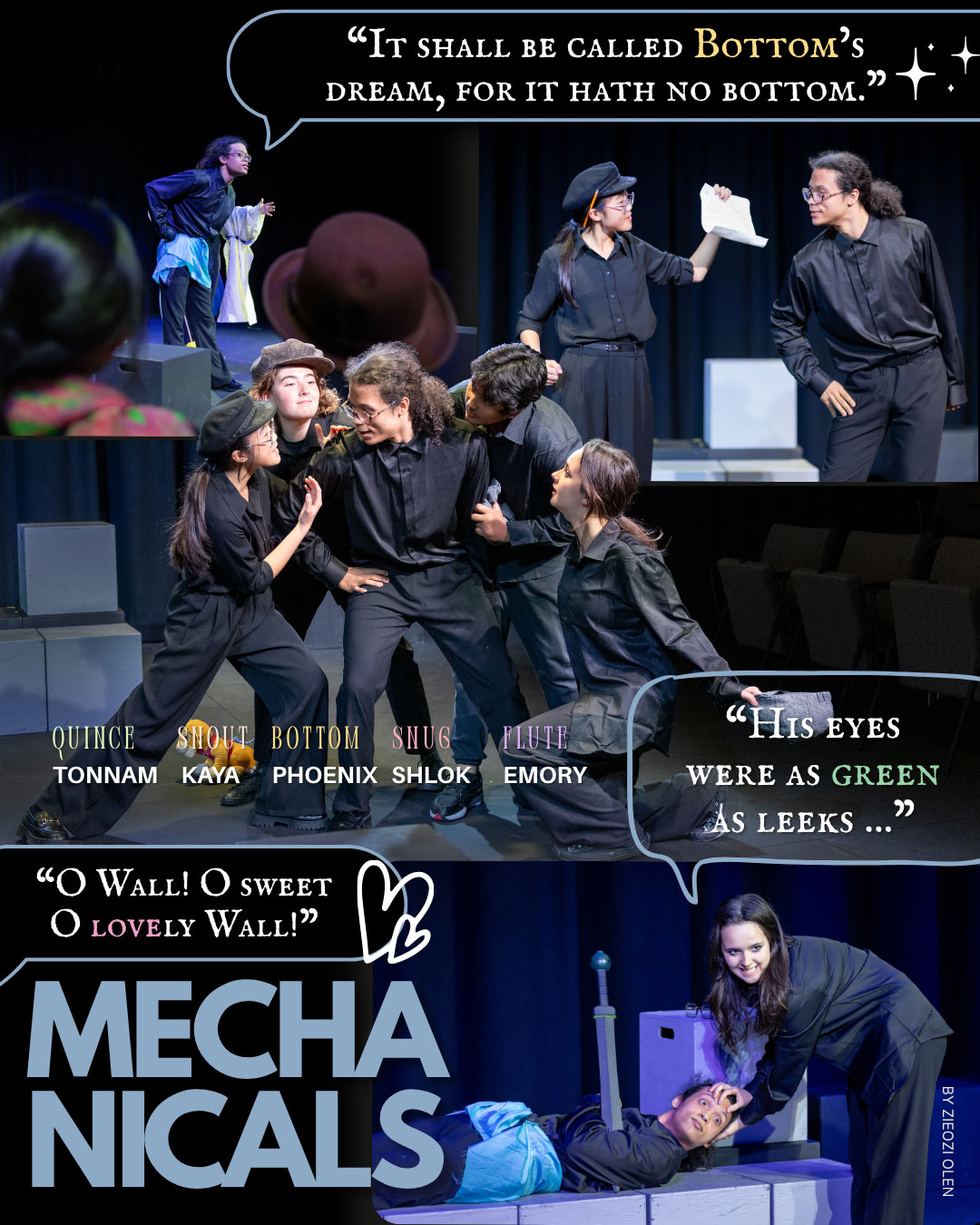 Anyway, when I finally got ready to post everything, I discovered that Instagram looked completely different on my computer than it did on my phone. Suddenly the blacks weren’t actually black anymore. I realized I’d forgotten to put my signature on most of the graphics. I noticed tiny inconsistencies I hadn’t seen before and spent another hour or two fixing what I could. Then, after I had already posted everything, I noticed Hermia’s lighting was still a little off.
Of course.
A few months earlier, that probably would’ve driven me crazy.
Instead, I looked at it for a minute and decided to leave it.
Working on these graphics from December all the way into the summer ended up teaching me something I wasn’t expecting. The longer I worked, the better I got. But because I was getting better, I also kept noticing more things I wanted to change. The goalpost just kept moving. Every improvement I made only made me aware of another improvement I could make.
At some point, you have to decide that something doesn’t need to be perfect to be worth sharing.
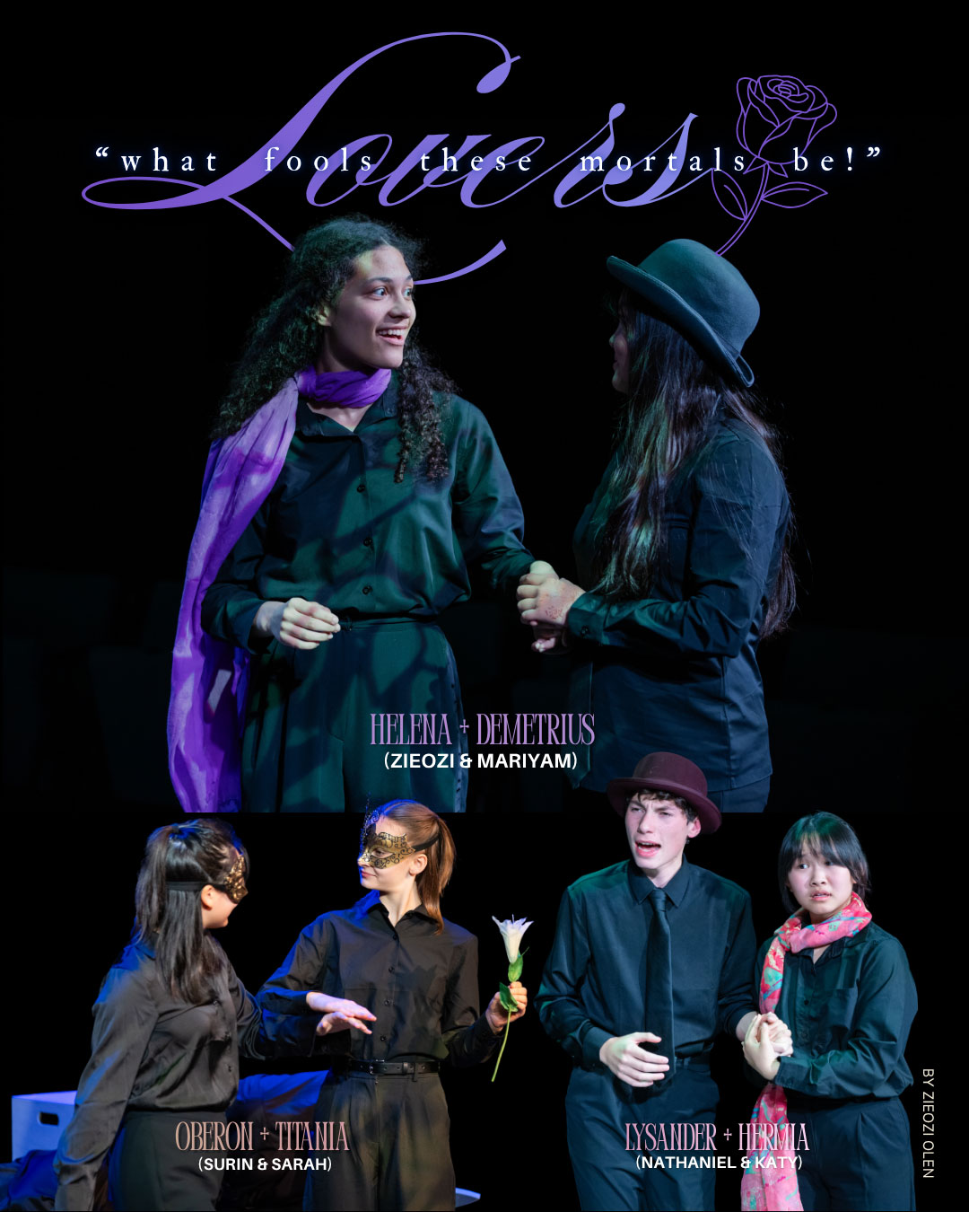 And I’m still really super proud of these designs!! They may not be flawless, but they represent where I was creatively over the past seven months, and even if they’re not perfect, I still think they look pretty damn good. If I remade them today, I’d probably do some things differently. And if future me remade them a year from now, she’d probably do everything differently. That’s not a bad thing. It just means I’ve continued to grow.
Growth is good. I think that’s the part I wasn’t expecting to learn from this project. Finishing something isn’t about reaching a point where there’s nothing left to improve, because that point probably doesn’t exist. As you learn and improve, your standards grow with you. There will always be another font to test, another color to adjust, another tiny detail that only you’ll ever notice.
Sometimes, though, you have to let your work represent who you were at that moment instead of holding onto it until it becomes “perfect.” Otherwise, you’ll spend so much time chasing perfection that you’ll never actually finish anything.
Now…
Time to get started on The Burrow.
